Fonts are considered as one of the important features in creating an artwork. The reason is that there’s no other way to make your work more expressive, interesting, and lively. Nonetheless, it has to be incorporated properly for it not to look weird or out of place. Here are 13 tips on how you can effectively use fonts in your artwork.
- Size Matters
Different fonts come in different sizes, what’s important is that you use the right size of font based on where it will be used. There are cases wherein the text needs to be larger than what it is because it will be posted on a billboard or any other outdoor advertisement medium. Letter fonts that are smaller than the usual size will appear blurry on those types of media.
- Spacing Is Crucial
Fonts vary in their shapes and looks, thus you must adjust the spacing between letters to bring out a better effect. Not giving enough or too much space makes your work look cluttered and messy, not to mention how difficult it will be to read.
- You Have To Use The Right Font Styles
There are various ways to incorporate fonts into your artwork and one of which is through vectorization. While this is a great way, the only downside is that you have to find the right font. There are times where using common or popular fonts can make you blend in with other artists who also use the same font. But if you want to stand out, it will be best to use relatively uncommon fonts.
- Fonts Are Not Only Letters
Fonts are not only composed of letters, there are cases when you need to draw the letters or numbers for your artwork instead of using fonts. In some cases, it will be difficult to incorporate a font on your artwork because it might not be available from the software that you use.
- Pick The Best Fonts
As mentioned earlier, there are many ways of incorporating fonts into your work and one of which is through vectorization. However, if you want the best results, you should use non-outlined fonts. This will give justice to your work and will let it look more alive and expressive than if you use outlined or filled fonts.
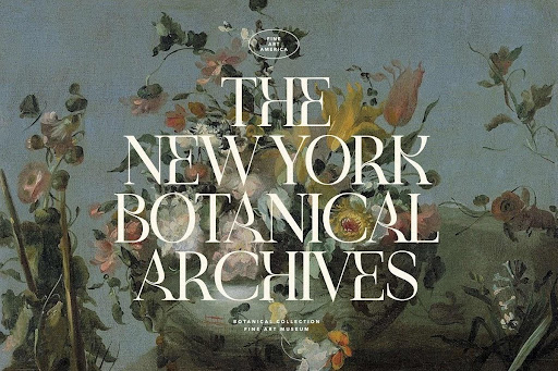
- Use Of Alternate Fonts
Just like any other aspect in creating an artwork, you can also use alternate font styles for a more interesting outcome. Take a look at the artwork below and you’ll find that there are times when the title is written in a different font than what is normally used.
- Experimenting Is Key
The most important tip on using fonts is to experiment with them! But remember, you don’t want your work to be too chaotic or messy because of bad mixing or the use of fonts. Take a look at the example below and you’ll find out that there are times when several different fonts couldn’t make the artwork look good.
Check out fresh and unique fonts on Creative Market.
- Don’t Forget The Title
One common mistake that beginners do is forgetting to include a title or focal point in their artwork. This will only ruin the whole purpose of your work, especially if you are creating something to be used for advertisement.
- Practice Makes Perfect
Just like any other aspect in creating an artwork, you must practice your fonts carefully. You can even print your work and focus on making the font’s size, spacing between letters and its focal point look good when printed.
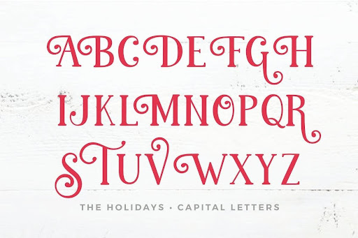
- Serif Font Vs. Sans Serif Font
You have to take note that out of the two categories, fonts are mostly categorized into serif and san serif types. One is where there are small lines at the end of each letter while in the other, there are only straight lines without any endings. Not all artwork uses serif or san serif just because of the fonts that they use.
- Cool Fonts Have Different Shapes And Sizes
Don’t forget to take note that fonts also come in different shapes and sizes, especially when you are working on artwork with small or big text. Using a smaller font for larger texts will make it look unbalanced.
Also Read: Why is modern art so expensive?
- Learn The Different Fonts
Knowing how to use the different fonts will surely benefit you in one way or another. Take note that not all fonts are created equal, some are meant for display while others are best suited for thin strokes and letters.
- Tell A Story With Your Artwork
The last tip on using fonts is to tell a story through your artwork. While this sounds easy, it can be difficult especially if you are dealing with more than one font in your work. Sometimes, the use of different fonts for different titles is the best thing that you could do because it will make your viewers focus on each title instead of making them all look important.
Takeaway
Fonts are an integral part of your artwork. It doesn’t matter if you are designing a simple logo or creating something that will be used for advertisement, fonts play a huge role in making your product look good and professional. It is important that you know how to use different fonts in order to make your work stand out above the rest.